Digital experiences for all disciplines
New Landing › How can we help? › Themeforest Theme Support › Uplift › Ignoring breakpoint for some rows
New Landing › How can we help? › Themeforest Theme Support › Uplift › Ignoring breakpoint for some rows
- This topic has 16 replies, 3 voices, and was last updated 7 years by
Swift Ideas – Ed.
-
Posted in: Uplift
-
August 29, 2016 at 6:40 pm #289707
Hello guys,
Is it possible to manipulate breakpoints for certain rows in a page layout?
My problem is that I need two pictures next to each other. This works fine for desktop, but the mobile
version does move these pictures under each other.I have a layout with 4 columns and for mobile and tablet I want to have a 2×2 layout.
I did not find out how to do this?Thanks!
August 30, 2016 at 6:47 pm #289919You might be able to force this by adding a custom class to the parent row or PB asset and then using a media query to force the width to what you require.
Add the custom class to the said items and let me know.
– David
August 31, 2016 at 10:05 am #290012Hey, thanks for your response.
I understand your approach, but what do I need to add to the CSS class exactly?
September 1, 2016 at 10:58 am #290187Hi,
Great, you can add a class using this:
September 9, 2016 at 10:57 am #291252Hey, I know how to add a extra class, but I do not know about the css-code that will do the job.
September 13, 2016 at 12:07 am #291595Hi @redro
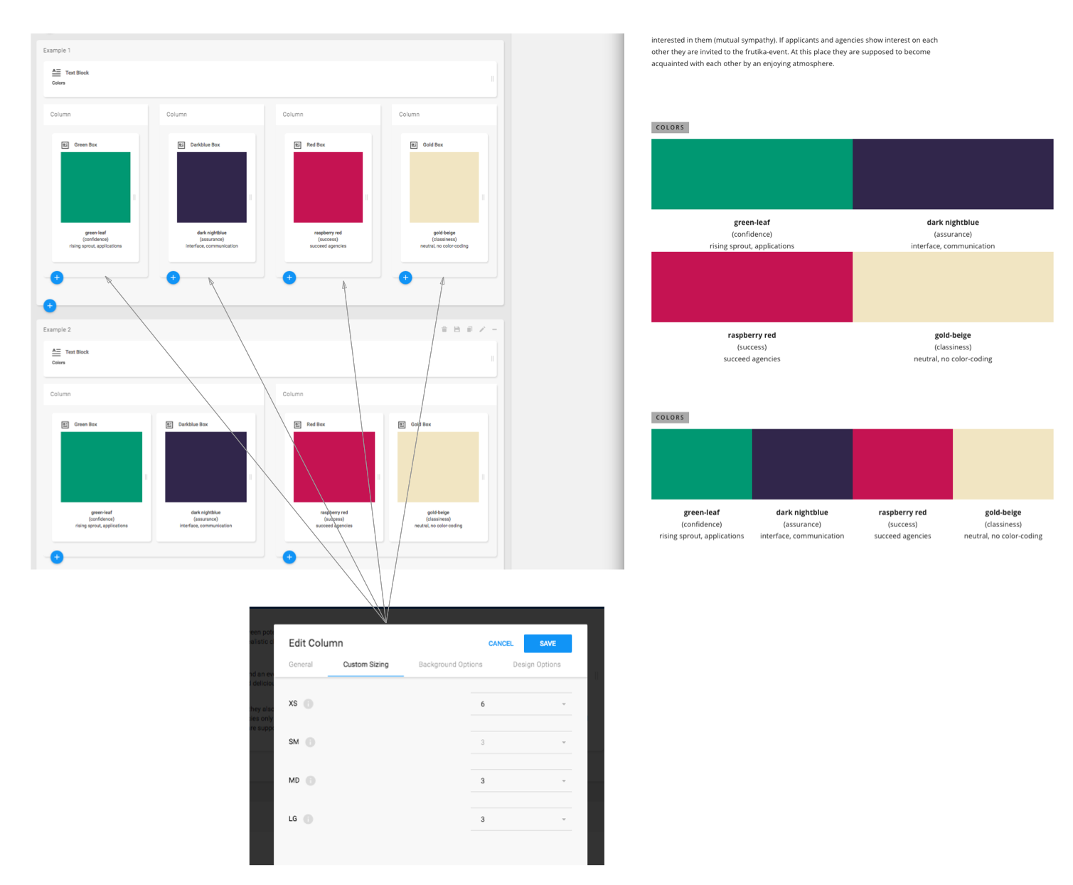
Can you please try using the included Custom Sizing options – under the Custom Sizing tab. If you set XS to 6, that will make it 50% on mobile. Also please add this custom css until the next update:
.col-xs-6 {
    width: 50%!important;
}
That should sort it.
– Ed
September 13, 2016 at 1:15 pm #291679Thanks! This works.
Is the topic “Custom sizing options” somewhere documented? I couldn’t find it. Having a lot of smart options to choose from is very handy, but without telling your clients/users about it, it just a waste of time.September 14, 2016 at 1:41 pm #291808Why are the rows breaking like this?
Attachments:
You must be logged in to view attached files.September 16, 2016 at 7:48 pm #292231We’ll sort out documentation for those options, they are new which is why there isn’t docs yet.
The rows are breaking like that because you have columns, and the columns group the elements. That column wraps the two elements within, so the columns stack when they are responsively resized. If you wanted the same order, you’d need to have one block in each column.
– Ed
September 17, 2016 at 11:24 am #292258So 4 columns and in each of them is one element?
This didn’t work for me.This is not urgent, I will wait for the docs.
September 18, 2016 at 10:37 pm #292321Can you link us to that page, and screenshot the admin side of it so that we can look into it?
Thanks,
– Ed
September 19, 2016 at 10:18 am #292382This reply has been marked as private.September 19, 2016 at 2:10 pm #292429Hi @redro,
Looks like you don’t have the XS column sizing set for the top set?
Also, looks like you have set col-xs-12 to 50%, rather than using xs-6?
– Ed
September 19, 2016 at 3:04 pm #292435Sorry, I deleted it to test whats going on without anything in it.
I put it back in. That wasn’t the source of the problem.The settings are as shown in the image above.
XS = 6, SM, MD, LG = 3Also, looks like you have set col-xs-12 to 50%, rather than using xs-6?
Custom-CSS isn’t in use for the columns, so I don’t understand what you try to tell me?
Just to be clear …
Tablet, Desktop:
X X X XSmartphone:
X X
X XSeptember 19, 2016 at 3:26 pm #292445Apologies, was a mistake with the css which I previously provided you. If you change:
.col-xs-6 {
    width: 50%!important;
}
to:
@media only screen and (max-width: 767px) {
.col-xs-6 {
    width: 50%!important;
}
}
That will sort it. Again, you can remove this code after the next update.
– Ed
-
Posted in: Uplift
You must be logged in and have valid license to reply to this topic.